Jacksonville Jaguars unveil new logo
 After a tumultuous season in which they went 2-14, the Jacksonville Jaguars seemed to have found the source of their woes: their logo.
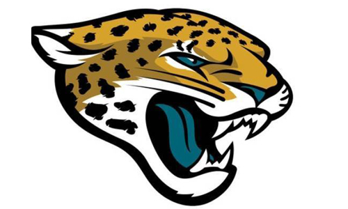
Okay, maybe not, but the team did unveil a new logo today, and while it won’t solve their offensive deficiencies or help new head coach Gus Bradley put together a perpetual contender in the AFC South, it’s a starting point for a franchise looking to turn things around. I personally like the new logo. It’s sleek, updated, and definitely gives off a more ferocious appearance than the original logo, which had been used since Jacksonville’s inaugural season in 1995.
Among some of the new features are the curved ears, different eye color, and white fur on the bottom of the face. We’ve seen other franchises give minor updates to their logos to make them look more fierce, most notably the Arizona Cardinals, Detroit Lions, and more recently, the Carolina Panthers.
Whether this new logo helps generate more revenue for a franchise that ranked 29th in the league in local revenue last season remains to be seen, but it’s clear that new owner Shad Khan has a vision for this team’s future, and I respect him for the approach he’s taking.


5 Burning Questions From 'THE AVENGERS'
How the frick did Ruffalo bring depth to the character?FISH OUT OF WATER: The Aquaman Conundrum
I can tell the author of this article isn't a big comic book fan. BaseINVITATION TO OPPORTUNITY
Writing this now in retrospect. Thank you Ben Cherington. Thank youNOT YOUR AVERAGE JOE: Why Joe Flacco is in a class of his own
Colin, Well written article here. I think Flacco is an elite quart